


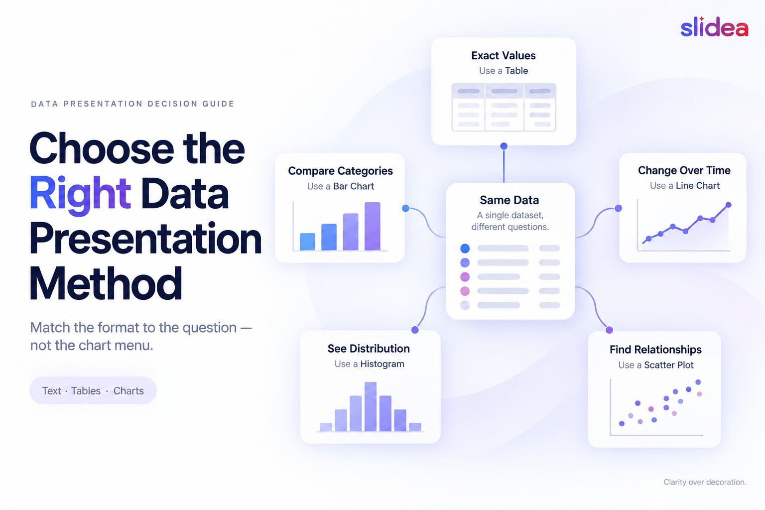
The right data presentation method depends on the question your audience needs to answer.
Use text for one important number, a table for exact values, a bar chart for category comparisons, a line chart for changes over time, a histogram or box plot for distributions, and a scatter plot for relationships between two numerical variables.
The format matters because the same dataset can communicate different messages depending on how it is presented. A table encourages people to look up exact values. A chart directs attention toward a pattern. A large number with a sentence tells the audience which result matters most.
This guide compares ten practical data presentation methods. For each one, you will see what it communicates, when it works, when it fails, and what can make it misleading.
Example data note: All figures used below are fictional. They describe an imaginary customer-support performance review created only to demonstrate the different presentation formats. They are not Slidea customer data, research findings, or case-study results.
How this guide was researched
The recommendations in this guide were checked against statistical, accessibility, and data-visualization guidance available on September 16, 2026.
The principal sources were:
- Office for National Statistics data-visualization guidance
- CDC Field Epidemiology Manual: Describing Epidemiologic Data
- NIST Exploratory Data Analysis guidance
- W3C Web Content Accessibility Guidelines techniques
- Statistical Data Presentation by In and Lee, published in the Korean Journal of Anesthesiology
Every recommendation must still be considered in the context of the actual dataset and audience. This guide does not apply unsupported universal limits to the number of rows, categories, lines, or data points a presentation may contain.
What are the three main methods of data presentation?
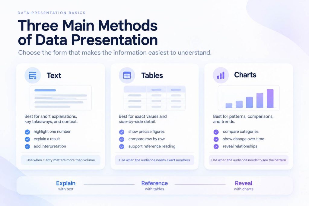
Data is commonly presented in three broad ways: text, tables, and graphical displays. This classification is described in the peer-reviewed paper Statistical Data Presentation.
Textual presentation
A textual presentation explains selected figures through sentences or annotations.
For example:
- Customer satisfaction increased from 74% in January to 82% in June.
This format gives the figures context and directs the audience toward one conclusion. It is useful when one or two values matter more than the rest of the dataset.
Text becomes difficult to scan when several values, categories, or periods must be compared.
Tabular presentation
A table organizes values into rows and columns.
Tables work when readers need exact figures, must compare several variables or may return later to look up a particular value. They are less effective when the main purpose is to reveal a trend immediately.
Graphical presentation
A graphical presentation uses charts, plots, maps or other visual forms to reveal patterns.
Graphs can make comparisons, changes and relationships easier to notice. They can also distort the message when the chart type, scale or labels are unsuitable.
The ten methods below are practical formats within these three broad categories.
Choose a data presentation method by the question.
Do not begin by asking, “Which chart looks best?”
Begin with the question your audience needs to answer. The Office for National Statistics recommends matching the chart to the relationship being communicated and using simple, familiar formats where possible.
Its guidance identifies eight common relationships: correlation, deviation, distribution, geography, magnitude, parts of a whole, ranking and time. See the ONS guidance for choosing a chart type.
| What should the audience understand? | Useful starting point |
| One result people must remember | Key figure with explanatory text |
| Exact values across several items | Table |
| Differences between categories | Bar chart |
| Change across time | Line chart |
| Relationship between two numerical variables | Scatter plot |
| Distribution of one numerical variable | Histogram |
| Differences between group distributions | Box plot |
| How a total is divided | Stacked bar or another composition chart |
| Concentration across two dimensions | Heat map |
| What the audience thinks during the session | Live-response visualization |
This table provides a starting point, not an automatic answer. The audience, dataset and required level of precision still matter.
1. Key figure with explanatory text
A key figure combines one important number with a short sentence explaining its meaning.
In the fictional support example, displaying only “82%” leaves several questions unanswered. A more informative version would be:
- Customer satisfaction increased from 74% in January to 82% in June.
The sentence supplies a baseline, direction, and period. A source note could then explain how satisfaction was measured.
Use a key figure when:
- One result matters more than the supporting details
- The audience needs a clear headline
- You are reporting progress against a target
- The number can be understood with a short explanation
Choose another method when:
- Several values must be compared
- The distribution behind an average matters
- The audience needs access to the underlying data
- The figure requires a long explanation to avoid being misunderstood
The common mistake is enlarging a percentage without showing what it measures.
“Complaints fell by 40%” is incomplete unless the audience can see the original number, comparison period, and definition of a complaint.
2. Tables
Tables are appropriate when exact values deserve attention.
Suppose the fictional support team received requests through four channels:
| Channel | Requests | Median resolution time | Satisfaction |
| 1,240 | 11.4 hours | 78% | |
| Live chat | 960 | 1.8 hours | 86% |
| Phone | 610 | 2.7 hours | 83% |
| Social media | 190 | 4.1 hours | 75% |
A reader can retrieve an exact request count, resolution time, or satisfaction result. A single chart would struggle to display all three measures without becoming difficult to interpret.
Use a table when:
- Exact values matter
- Readers may need to look up individual entries
- Several measures must be shown together
- Values cannot be reduced to one clear visual relationship
Choose another method when:
- The audience needs to recognize a trend immediately
- The table will be projected in a large room
- Most cells do not support the presentation’s conclusion
- The presenter plans to read every value aloud
Remove columns that do not serve the message. Align comparable numbers consistently, state the units, and include a source or methodology note.
The CDC recommends that statistical displays identify their subject clearly and contain titles, data, footnotes, and explanatory text. Its guidance also describes tables as suitable for displaying numerical values. See the CDC Field Epidemiology Manual.
3. Bar charts
Bar charts compare values across separate categories.
Using the fictional data, a bar chart could compare customer satisfaction across email, live chat, phone, and social media. The lengths of the bars allow the audience to judge which categories are higher or lower.
The ONS describes bar charts as its preferred method for comparing a single variable across categories. It also states that a bar-chart axis should begin at zero.
Because bars encode values through length, using a non-zero baseline can visually exaggerate differences. If a zero baseline prevents the data from being displayed clearly, the ONS recommends choosing another chart type, such as a dot plot. See the ONS bar-chart guidance.
Use a bar chart when:
- Categories are separate rather than continuous
- Relative size or ranking is the main message
- Long category labels fit more naturally beside horizontal bars
- One variable is being compared across groups
Choose another method when:
- The horizontal dimension represents continuous time
- The dataset contains too many categories to display clearly
- The audience needs several exact measures for every category
- The data represents a distribution rather than named categories
When rank is the message, sorting bars by value usually makes comparison easier. Maintain a natural order when categories already have one, such as age ranges or stages in a process.
Do not shorten a bar-chart axis to exaggerate a small difference. In the fictional data, displaying satisfaction values of 78% and 83% on an axis beginning at 75% would make the difference appear much larger than it is.
4. Line charts
Line charts show change across an ordered sequence, most commonly time.
For example, a line chart could display fictional monthly customer satisfaction:
| Month | Satisfaction |
| January | 74% |
| February | 75% |
| March | 77% |
| April | 76% |
| May | 79% |
| June | 82% |
The chart makes the general upward trend visible while preserving the temporary decrease in April.
Use a line chart when:
- Time or another continuous sequence is meaningful
- The audience needs to see direction and variation
- Several related trends must be compared
- Intervals between observations are clear
Choose another method when:
- Categories have no meaningful order
- Only two independent values are being compared
- Connecting the points would imply continuity that does not exist
- Too many overlapping lines would conceal individual patterns
Line charts do not always need to begin at zero. Unlike bars, their values are represented by position rather than length. A cropped scale may reveal a trend more clearly, provided the scale is visible and does not create a misleading impression.
The ONS recommends line charts for displaying trends over time. It also advises leaving a visible gap when expected data is missing rather than connecting across the missing period. See the ONS line-chart guidance.
5. Scatter plots
A scatter plot examines the relationship between two numerical variables.
Imagine that every dot represents one fictional support agent. The horizontal axis shows completed training hours, while the vertical axis shows customer satisfaction. The pattern can help the audience inspect whether higher training time is associated with higher satisfaction.
Use a scatter plot when:
- Both variables are numerical
- Each dot represents one observation
- The audience needs to inspect correlation, clusters or outliers
- A relationship matters more than exact individual values
Choose another method when:
- One variable consists of named categories
- There are too few observations to reveal a pattern
- Overlapping dots prevent the distribution from being seen
- The presentation needs to compare averages rather than observations
A visible relationship does not establish causation. Agents who completed more training may also have greater experience, different workloads or different types of customers.
The plot can reveal a question worth investigating. It cannot prove the cause by itself.
Label both axes with the variable and unit. If color or shape represents a third variable, explain it directly and ensure that color is not the only distinguishing feature.
6. Histograms
A histogram shows how values of one continuous variable are distributed.
Unlike a standard bar chart, its horizontal axis contains numerical intervals rather than named categories. Adjacent bars normally touch because the intervals form a continuous range.
The fictional support dataset could group resolution times into intervals such as:
- Under 1 hour
- 1 to under 2 hours
- 2 to under 4 hours
- 4 to under 8 hours
- 8 to under 16 hours
- 16 hours or more
The resulting shape would show whether most requests are resolved quickly, whether there is a long tail of slower cases, or whether there are multiple clusters.
NIST describes a histogram as a method for summarizing the distribution of one variable, including its center, spread, skewness, outliers, and possible multiple modes. See the NIST histogram guidance.
Use a histogram when:
- One continuous variable has many observations
- The shape of the distribution matters
- You need to reveal concentration, skewness or multiple peaks
- Exact individual values are not required
Choose another method when:
- The values are named categories
- The audience needs exact observations
- Only a few data points are available
- Several groups must be compared directly
The interval boundaries can change the chart’s appearance. Narrow intervals may emphasize random noise, while broad intervals may hide meaningful clusters.
Rather than applying a universal number of bins, inspect more than one reasonable interval width and confirm that the conclusion is not an artifact of that choice.
7. Box plots
A box plot summarizes a distribution using its median, quartiles, and whiskers. Some implementations also display potential outliers as individual points.
The fictional support review could place one box plot beside each service team. This would allow the audience to compare typical resolution time, variability, and unusual cases without showing every observation separately.
Use a box plot when:
- Several group distributions must be compared
- Median and spread matter
- Outliers or unusually wide variation deserve attention
- The audience understands quartiles or can be given a short explanation
Choose another method when:
- The audience is unfamiliar with the format
- The complete shape of the distribution matters
- The dataset is very small
- A simple median or range would answer the question
A box plot compresses information efficiently, but it can also hide distribution shape. Two groups can have similar boxes even when one distribution is concentrated in the center, and the other contains separate clusters.
Whisker and outlier definitions can vary between tools. Before presenting the chart, confirm how the software calculates them. Do not automatically describe the whiskers as the minimum and maximum unless that is how the chart was configured.
For a general audience, include a small visual key showing what the median line, box, and whiskers represent.
8. Composition charts
Composition charts show how a total is divided among components.
In the fictional example, 3,000 support requests are divided among email, live chat, phone, and social media. A stacked bar could show the share contributed by each channel.
A regular stacked bar preserves both the total and its components. A 100% stacked bar makes proportional differences easier to compare when the totals themselves are not important.
Use a composition chart when:
- The categories make up a meaningful whole
- Components do not overlap
- The total or proportional composition matters
- The categories remain understandable
Choose another method when:
- The values do not add to a meaningful total
- Precise category comparison is required
- Several middle segments have similar values
- Categories overlap, or respondents could select more than one answer
The ONS recommends stacked bars for comparing how components form totals. It also warns that middle segments are difficult to compare because they do not share a common baseline. See the ONS stacked-bar guidance.
Should you use a pie chart?
A pie chart may work for one simple part-to-whole message where the sections are clearly different.
It becomes less useful when several slices are similar, exact comparison matters or the audience must compare multiple pies. In those situations, a sorted bar chart or 100% stacked bar provides a clearer common baseline.
Avoid 3D treatments. Perspective can make slices nearer the viewer appear larger even though the underlying values have not changed.
9. Heat maps
A heat map uses color intensity to represent values across two dimensions.
For the fictional support dataset, rows could represent weekdays and columns could represent hours. Darker cells could indicate periods with more incoming requests. The visual would help a manager identify concentration, such as unusually high volume on Monday mornings.
Use a heat map when:
- Patterns across two dimensions matter
- Exact individual values are secondary
- The audience needs to identify clusters, gaps or high-intensity areas
- The ordered structure of rows and columns carries meaning
Choose another method when:
- Values vary only slightly
- Exact numbers are the primary requirement
- Too many cells would become unreadable
- Color would be the only way to understand the result
Use a sequential color scale for values moving from low to high. Use a diverging scale only when there is a meaningful midpoint, such as zero, a target or an average.
Do not depend on red and green alone. The ONS recommends sufficient contrast and colors that remain distinguishable for people with color-vision deficiencies.
When separate colors represent categories, the ONS recommends using five or fewer. A quantitative heat map is different: it uses an ordered color scale, where additional shades may be appropriate if neighboring values remain distinguishable. See the ONS guidance on using colors in charts.
10. Live audience-response visualizations
A live-response visualization collects data while a presentation is happening and displays the result to the room.
Suppose a presenter is about to explain the fictional support dataset. Before revealing the actual result, they could ask:
- Which channel do you think has the longest median resolution time?
The audience votes, the response distribution appears and the presenter then compares that expectation with the prepared data.
Other live formats include:
- Multiple-choice polls
- Rating scales
- Rankings
- Open-text responses
- Word clouds
- Numerical estimates
- Quiz responses
For agreement or satisfaction questions, the response scale affects how the resulting chart can be interpreted. Review these Likert scale types and examples before designing a rating question.
A word cloud can help surface frequently repeated words or short phrases. It is not suitable for precise comparison or sentiment measurement by itself. These word-cloud presentation examples show where the format is useful.
Use a live-response visualization when:
- You want to check audience understanding
- The group needs to prioritize options
- A prediction will make the actual result easier to discuss
- You need immediate feedback before moving forward
Do not treat it as formal research when:
- Participation is voluntary or incomplete
- The audience is not representative of a wider population
- Respondents can influence one another
- The wording pushes people toward a particular answer
- Sensitive responses may appear publicly
A live poll describes the people who responded in that session. It should not be presented as a scientific survey of customers, employees or the public unless its sampling and research design support that conclusion.
If you need deeper feedback collected over a longer period, follow this guide to creating a live survey rather than assuming a single live poll and a formal survey are interchangeable.
Slidea includes live polls for presentations such as Multiple Choice, Scales, Ranking and Guess the Number. Responses can be displayed during the presentation. This makes the format useful for showing what the participating room thinks, but it does not replace a properly designed research study.
What about radar charts and pictograms?
Radar charts and pictograms are not automatically wrong. They simply require more caution than familiar formats.
Radar charts
Radar charts plot several measures on axes extending from a central point.
They can provide a compact profile, but precise comparison is difficult. The resulting shape may appear substantially different because of axis order, scale or the area enclosed by the points.
Use a table, dot plot or small set of bar charts when the audience needs to compare individual measures accurately.
Pictograms
Pictograms repeat icons to represent quantities. They can make a simple statistic approachable, but they consume space and become difficult to compare as values increase.
Partial icons can also be confusing. If one icon represents ten customers, the meaning of three-quarters of an icon must be completely clear.
Decorative infographics
An infographic can combine text, illustrations and data effectively. Decoration should not replace scales, labels, units, sources or accessible text.
If removing an illustration changes the apparent value of the data, the design is probably doing more than decorating.
Five ways a data presentation can mislead
1. Truncating a bar-chart axis
A shortened baseline makes small differences in bar length appear large. Bar charts should begin at zero because viewers interpret their lengths.
This rule does not apply identically to every chart. A clearly labelled line-chart scale may be narrowed to reveal variation because the values are encoded by position rather than bar length. The ONS axis guidance explains this distinction.
2. Removing the comparison
“Customer satisfaction is 82%” may sound positive, but the audience cannot determine whether the result improved, declined, or missed its target.
Include a relevant baseline, target, or prior period when the comparison forms part of the conclusion.
3. Cherry-picking the period
A line may appear to rise if the chart begins at a temporary low point. Expanding the date range might reveal that the current value remains below its longer-term level.
Choose the period before deciding which story you want the chart to tell, and explain important exclusions.
4. Using area or volume for a one-dimensional value
Large circles, human figures and 3D objects can exaggerate differences because their area or volume changes faster than their height.
Use position or length when accurate comparison matters.
5. Hiding uncertainty, missing data or methodology
An average can conceal variation. A survey result can conceal sample size. A line can conceal missing months if the gap is connected.
Show uncertainty or missing data where it changes interpretation. At minimum, provide the source, date, measure, unit, and important methodological limitations.
How to present data clearly on a slide
1. Write the conclusion first.
Complete this sentence before opening a chart tool:
- After seeing this slide, the audience should understand that…
If the sentence contains several unrelated conclusions, separate them.
2. Choose the format that answers the question
Use the decision table near the beginning of this guide. Do not select a chart because it is visually unusual or available in the software menu.
3. Remove details that do not support interpretation
Delete decorative borders, unnecessary legends, repeated labels and unrelated series.
Do not remove inconvenient data, uncertainty or context. Simplifying the presentation is different from selectively simplifying the evidence.
4. Write a takeaway title
“Customer satisfaction” identifies the subject.
“Customer satisfaction increased after April” communicates the finding.
A takeaway title helps the audience understand why the chart is present, provided the wording does not claim more than the data supports.
5. Include essential context
Depending on the chart, include:
- Measure and unit
- Population or sample
- Place
- Time period
- Source
- Relevant exclusions
- Notes explaining transformed or estimated values
6. Test the slide at presentation size
A chart that looks readable on a designer’s monitor may fail when projected in a room or viewed on a phone.
Test the slide from the expected viewing distance. If labels cannot be read, reduce the information or divide the visual rather than shrinking the text.
Data-presentation accessibility checklist
Accessible charts help more people understand the evidence and often make a presentation clearer for everyone.
- Do not use color as the only distinguishing feature.
- Add direct labels, patterns, symbols or line styles where appropriate.
- Use sufficient contrast between text, graphics and the background.
- Write a descriptive title that communicates the main finding.
- Provide alternative text describing the chart type and primary takeaway.
- Include an accessible data table when exact values are important.
- Keep essential information in text rather than embedding everything inside an image.
- Make interactive charts usable without relying only on hovering.
- Provide controls for animations and never make animation the only way to access the information.
- Explain unfamiliar formats such as box plots before asking the audience to interpret them.
W3C guidance says information communicated through color should also be available through another visual method, such as a pattern. See W3C Technique. G111: Using color and pattern.
For chart alt text, describe the chart and its main message rather than writing “graph” or repeating the visible caption. The ONS chart-text guidance recommends stating the chart type and main trend.
Frequently asked questions
What are the three main methods of data presentation?
The three broad methods are textual, tabular, and graphical presentation. Text highlights selected figures and explains their meaning. Tables organize exact values for lookup and comparison. Graphical displays use charts, plots, or maps to reveal patterns, trends, distributions, and relationships.
What is the best method for presenting data?
There is no universally best method. Use text for one or two important figures, tables for exact values, bar charts for category comparisons, line charts for changes over time, histograms or box plots for distributions, and scatter plots for relationships between numerical variables.
When should a table be used instead of a chart?
Use a table when readers need exact values or must compare several measures for individual items. Use a chart when the primary goal is to reveal a pattern, ranking, trend, distribution or relationship quickly.
What is the best chart for comparing categories?
A bar chart is normally the clearest starting point for comparing values across separate categories. Begin its quantitative axis at zero and arrange the categories in a logical order. A table may be better if exact values or several measures matter.
Can a line chart start above zero?
A line chart can start above zero when a narrower, clearly labelled scale is needed to reveal variation. However, the scale must not hide relevant context or exaggerate the conclusion. Bar charts normally need a zero baseline because their values are represented through length.
How can data be presented during a live presentation?
A presenter can display prepared charts or collect audience responses through polls, ratings, rankings, numerical estimates, and open-text questions. Live responses should be described as feedback from the participating audience, not as representative research unless the sampling and methodology justify that claim.
Final decision checklist
Before adding a visual to a presentation, ask:
- What single question should it answer?
- Does the format match the type of data?
- Can the audience identify the conclusion quickly?
- Are exact values available when they matter?
- Does the scale represent differences honestly?
- Are the unit, date and source visible?
- Is missing data acknowledged?
- Is uncertainty explained where it affects the conclusion?
- Can the message be understood without color alone?
- Is the visual readable from the expected distance?
- Would a simpler format communicate the result more clearly?
If you cannot answer the first question, the problem is not the chart design. The purpose of the slide is still unclear.
Clear data presentation begins with that purpose. The objective is not to make data look impressive. It is to make the evidence understandable without changing what it means.






Leave a Comment
Your email address will not be published. Required fields are marked *